The track map and sector splits in sim telemetry are the navigation layer that tells you where on the lap to look before you ever read a single input trace. Click a corner on the map and every channel jumps to that point; read your sector and mini-sector times against a reference and you instantly see which third — or which fifty metres — of the lap is costing you. On my rig this is the first thing I open, because it turns a wall of data into a short list of corners worth fixing.
Most drivers skip straight to the brake trace and get lost. The map and the sectors are what stop that: they localise the problem so you spend your attention where the time actually is. This guide covers how to use both, and it is one spoke of the broader sim racing telemetry guide — start there for the full picture and the tools that draw these maps.
What the Track Map Adds to Telemetry
The track map is a top-down plot of the racing line built from your GPS-style position data, and its job is navigation. In MoTeC and most overlay tools the map is clickable and linked to the data cursor: click turn six on the map and every channel below snaps to turn six. That link between geography and data is what makes a hundred channels usable, because you stop scrolling through time and start jumping to places.
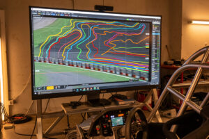
The map also shows you line, not just inputs. Overlay your driven line against a reference and you can see where you ran wide, clipped an apex early, or used too little exit kerb. A speed-coloured map — where the line is tinted by speed — makes slow corners jump out visually before you read a number. It is the fastest way to get oriented in a fresh data set. The deeper input reading that follows lives in the reading telemetry data guide.
Sectors: The First Filter
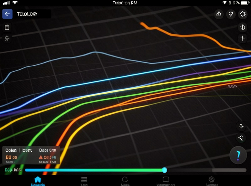
Sectors divide the lap into timed segments — classically three, the same ones you see on a live timing screen. Comparing your sector times against a reference is the coarse first filter: if you are level in sectors one and two but half a second down in sector three, you know exactly where to spend your analysis time. There is no point dissecting a corner in a sector you are already fast in.
The power of sector timing is that it is fast and unambiguous. You do not need to read a single trace to know which third of the track is the problem; the clock tells you. I always check sector deltas before opening any channel, because it stops me wasting twenty minutes optimising a corner that was never costing me anything. Sectors point; the input traces explain.
Mini-Sectors: Where the Real Precision Is
Three sectors are a blunt instrument — a single bad corner can hide inside an otherwise strong sector. Mini-sectors fix that by chopping the lap into many small segments, sometimes dozens, each independently timed against the reference. Now instead of “sector three is slow” you get “the segment through the turn-eleven complex is slow,” which is a corner, not a third of a lap.
Mini-sector analysis is how you find the small, repeatable losses that add up. A few hundredths here and there across a lap are invisible in three-sector timing but obvious in mini-sectors, and those scattered hundredths are often where a mid-pack driver becomes a front-runner. Many overlay tools colour each mini-sector green or red depending on whether you beat the reference there, giving you an at-a-glance map of exactly where to work. Combined with the comparison laps method, mini-sectors are the most efficient way I know to prioritise.
The Theoretical Best Lap and Why It Matters
String together your fastest-ever time in each sector or mini-sector and you get a theoretical best lap — the time you would post if you nailed every segment in one go. The gap between your theoretical best and your actual best is a precise measure of your consistency: a small gap means you string corners together well; a large gap means you have the speed but cannot link it.
This number reframes practice. If your theoretical best is already quick but your real laps are well off it, the problem is not raw speed — it is putting it together, which is a consistency and concentration issue more than a setup one. If your theoretical best itself is slow, you need more pace in specific segments, and the mini-sectors tell you which. I check this gap regularly because it tells me whether to chase speed or chase consistency, and those are very different training jobs. The coaching and improvement guide digs into the consistency side.
Reading a Speed-Coloured Map
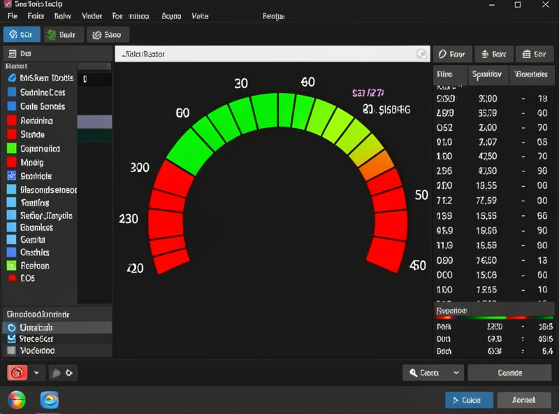
The single most useful view I keep open is the speed-coloured track map: the driven line tinted from cool to warm by speed, with your lap and a reference side by side. Slow corners glow one colour, fast sections another, and the places where your colours differ from the reference are losses you can see before you read a number. It is pattern recognition rather than arithmetic, and the eye is fast at it.
Two patterns stand out on a coloured map. A patch where your line runs cooler than the reference through a corner means you carried less speed there — an entry or mid-corner problem. A line that physically diverges from the reference — running wider, apexing earlier — shows a line error even where the speeds match, because a worse line will cost you on the next corner or straight. The map catches line mistakes that the channel traces alone can hide, which is why I orient on it first.
Colour also exposes inconsistency across your own laps. Lay three of your laps on the map and the corners where the colours scatter are the corners you have not yet learned to repeat. That scatter is the same consistency story the theoretical best lap tells with a number, shown geographically — and it points straight at the segments worth drilling.
A Map-and-Sector Workflow
Here is the order I actually work in. Open the track map and the sector deltas first. Identify the one or two sectors where you lose the most, then drop to mini-sectors within those to pin the exact corners. Click those corners on the map to snap every channel to them, and only then read the brake, throttle, and steering traces to find the cause. This top-down path — sector, mini-sector, corner, channel — stops you drowning in data.
The mistake is going bottom-up: opening the brake trace for the whole lap and trying to spot problems by eye. That works for one obvious mistake but misses the scattered small losses entirely, and it wastes time on corners that were never slow. Let the map and the sectors do the triage. They are the cheapest, fastest part of telemetry and the part most people ignore. Get oriented first, then go deep — the MoTeC guide shows how to build a workspace that keeps the map, sectors, and channels on one screen.
The Sector Mistakes That Mislead You
The first sector-analysis trap is comparing against a reference set under different conditions. A reference lap from cooler track, more fuel, or a different tyre state will throw your sector deltas off in ways that have nothing to do with your driving. Keep the comparison honest — same car, comparable conditions — or the sectors will send you chasing time that was never there.
The second trap is over-reacting to a single fast sector you cannot repeat. One green sector in twenty laps is noise, not pace; if you cannot hit it consistently, it does not belong in your realistic target. I weight a sector by how often I can produce it, not by the one heroic attempt, because races reward the time you can deliver lap after lap rather than the time you found once and never again.
The third is forgetting that sectors are arbitrary cut points. A braking zone that straddles a sector boundary can make a single mistake bleed across two sectors and look like two small problems instead of one big one. When a loss sits near a boundary, drop to mini-sectors or click the map to see the whole corner as one event — the geography is real where the sector lines are not.
Per-Sim Notes on Maps and Sectors
The position data that draws a clean map is excellent in iRacing and ACC, so both produce accurate, clickable maps in MoTeC and the major overlay suites. iRacing’s native data exports straight into this workflow, and ACC’s MoTeC logging includes the position channels needed for a faithful map and reliable sector splits — see the ACC setup guide for enabling logging. AMS2 and rFactor 2 also expose position data, though the overlay support varies by tool.
Whichever sim you run, the principle is identical: the map and sectors are the index, the channels are the chapters. Read the index first. If you are still building the rig and software stack that makes all of this possible, the complete rig build guide and the telemetry hub cover the foundations, and the reading telemetry data guide picks up where the sectors leave off.
Where to Go Next
Once the map and sectors have pointed you at a corner, the next step is reading the input traces and comparing laps properly. These guides continue the path: